CSS Radial Gradients
Radial gradients are very useful in creating attractive web designs and all modern browsers have at least basic support for them now. However, I've always felt a little daunted by their complicated syntax. Mostly I can never remember how the heck to write one when I need to and checking online documentation can be scary simply because radial gradients in CSS happen to be pretty flexible. Case in point, the full mozilla syntax definition found on the MDN page for radial-gradient() reads as follows:
radial-gradient( [ circle ||  <length > ] [ at  <position > ]? ,
                 | [ ellipse || [ <length > |  <percentage > ]{2}] [ at  <position > ]? ,
                 | [ [ circle | ellipse ] ||  <extent-keyword > ] [ at  <position > ]? ,
                 | at  <position > ,
                  <color-stop > [ ,  <color-stop > ]+ )
where  <extent-keyword> = closest-corner | closest-side | farthest-corner | farthest-side
  and  <color-stop> =  <color > [  <percentage > |  <length > ]?
Yowza! That looks really complicated. Honestly, they're not as bad as they look though. Learn 'em once and you'll be making all kinds of eye-popping designs without having to always stop and Google/Bing/Duck Duck Go it every time.
First, let's find out just where exactly we can use the radial-gradient() function.
Where to use radial-gradient()
radial-gradient() is the sibling function to CSS's other main gradient function, linear-gradient(). You can use radial-gradient() in all the same places as linear-gradient(), but 9 times out of 10 you're going to want to use a radial gradient as a background for some container element. For this, background-image has you covered. It's by far the most common way to use radial-gradient().
background-image: radial-gradient(circle, #fff, #000);You might be surprised to hear that you also can use them pretty much anywhere you would typically use an image in CSS! Basically, if a property takes url() for a value, you can replace that with radial-gradient() for some interesting effects. This includes list-style-image, border-image, mask-image and more. Browser support varies for these uses however so be careful. Using radial-gradient with background-image however is pretty safe at this point.
The Syntax
Basically, a radial gradient consists of a gradient shape definition (the part that says how big it is and/or where it sits in relation to your element) and then a bunch of comma-delimited color stops to define what colors you want to use in your gradient. That's pretty much it!
background-image: radial-gradient(<gradient shape definition>, <color-stop>,
  <color-stop>, <color-stop>, ...);
You can have as many color stops as you want but the tricky part is in the gradient shape definition so let's look at that first:
Gradient Shape Definition
The gradient shape definition part of the syntax consists of a few parts:
| ending-shape | The shape of the gradient. Can be "circle" or "ellipse". |
| size | The overall size of the gradient. Defines the radius and can be any length value like px, em, rem, vw, etc. |
| position | The x/y point on the containing element where you'd like the center of your radial gradient to appear. |
Ending Shape
"Ending shape" is w3c parlance for the overall shape of the gradient. It's the first part of the shape definition and it can be either "circle" or "ellipse". Which one you choose affects what other values you can use in the rest of the shape definition. It's optional so you can leave this out and the browser will typically assume you meant "circle", but it's best to define it because if you leave it out then depending on the rest of your shape definition, the browser may assume you meant "ellipse", which might not be what you're expecting. Best to be specific.
Size
Next is the size of the gradient. This is the length from the center of the gradient to the outer-most edge of the gradient (otherwise known as the radius - hey, I know some math). Any length unit is acceptable here. However, you can only use percentages if your ending-shape is an ellipse. You might think that's a little weird. If it seems unusual to you, just know that the spec currently mentions that this may come in a later revision. It sounds like a limitation that they're working through now but we'll have to wait and see how it all works out. For now, only use percentages on ellipses.
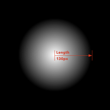
Circles only take one length for the size value, but ellipses require two: one for the x-axis, one for the y-axis.
background-image: radial-gradient(ellipse 250px 10%, #FFF, #000);"Extent" keywords:
You can also define the size using keywords called extent-keywords. They are any one of closest-corner, closest-side, farthest-corner or farthest-side and they're totally unique ways of sizing your gradient that are derived from the gradient's position. They're frankly a little confusing at first but to me, they seem helpful in making sure your gradient covers the desired area of your element, particularly in instances when you may not know what the element's size is or when percentages or static lengths just ain't cuttin' it.
MDN describes them well so I'll shamlessly copy their descriptions here:
| closest-side | The gradient's ending shape meets the side of the box closest to its center (for circles) or meets both the vertical and horizontal sides closest to the center (for ellipses). |
| closest-corner | The gradient's ending shape is sized so it exactly meets the closest corner of the box from its center. |
| farthest-side | Similar to closest-side, except the ending shape is sized to meet the side of the box farthest from its center (or vertical and horizontal sides). |
| farthest-corner | The gradient's ending shape is sized so it exactly meets the farthest corner of the box from its center. |
If that sounds confusing don't worry, you're not alone. I didn't really understand them until I chose one and then started messing around with the position of the gradient. Basically they size your gradient to be just the right size to touch a specified side or corner of your element, taking into account which side or corner is closest to the gradient's specified center position. You may not even notice a difference until you try it with a few different positions other than 50% 50%, since these keywords are mostly useful for gradients that are positioned at non-centered positions. They do seem useful once you see how they work though, so play around and see what you think.
Position
This defines the point on your containing element where the center point of your radial gradient will appear. This is your standard CSS position object so you can provide one or both position values. Also, percentages and negative values are both allowed. Plus you can use position keywords if you prefer (eg. "top", "bottom", "left", "right", "center"). Just remember this needs to be defined here in the radial-gradient() value itself - background-position won't have any effect on your gradient if you also define it seperately on the same element.
So, putting it all together, the whole definition looks like:
<ending-shape> <size> at <position>Here are some examples of valid shape definitions:
circle at 50% 50%circle 100px at 50% 0%circle 100px at center topellipse 20% 60% at left 10%ellipse 300px 100% at center centerColor Stops
Color stops are the easy part - they're just like in linear-gradient(). Each stop consists of a color value and an optional percentage to say where along the gradient (that is, where along the gradient "ray" or "line" or whatever you want to call it) the color stop should sit. You can have as many as you want so go nuts! However if you're looking for so many of them that it's getting a little silly, maybe what you really want is repeating-radial-gradient(), which lets you define a repeating pattern of stops that go on and on forever. It's basically the repeating version of radial-gradient(), much like linear-gradient() has a repeating version called repeating-linear-gradient().
Browser Support
Support for radial gradients on background images is about the same as for CSS's other gradient functions. Firefox and Chrome have been supporting the current spec for a long time now but they both offered prefixed versions for a long time before that so it wouldn't hurt to slap prefixed versions of your radial gradient in your code too. The webkit prefix is especially important for older versions of Safari, iOS and Android where support doesn't go back quite so far. There have been previous syntaxes supported in the past as well but the current spec has been in Candidate Recommendation status since 2012 so I personally wouldn't bother getting into writing those unless I needed really hardcore support for older browsers.
IE is the big issue of course. IE10 and up supports the official new syntax described in this article without a prefix, but to support IE 9 and below you'll need a fallback. If all you need is IE9 support you may be able to get away with using an SVG since IE9 has pretty decent SVG support. But, if you need to step back into the dark ages and support IE8 you'll need to use IE's proprietary filters. I won't go into those here but that seems to be about your only recourse. Just a note: IE did support a prefix for gradients at one point but as I understand it, that was strictly for developer preview builds of IE10 and the final commercial build of IE10 is thankfully prefix-free.
Support for radial gradients in places other than background images is a little rougher so be sure to check out various compatibility tables published throughout the web. You may be surprised how much works these days though - I was definitely surprised while writing this article by just how excellent gradient support has gotten. For all the frustration they can sometimes cause, modern browsers are pretty amazing.
More Resources
CSS Image Values and Replaced Content Module Level 3 (Radial Gradients section)
http://www.w3.org/TR/css3-images/#radial-gradients
radial-gradient() entry @ Mozilla Developer Network
https://developer.mozilla.org/en-US/docs/Web/CSS/radial-gradient