How-To: Designing On a Grid
Designing on a grid is a huge part of making professional-looking, polished websites but to somebody who's never really used a grid before, the very idea can be pretty daunting. Every designer seems to have his or her own special way of actually going about doing it and there's a virtually endless list of special tools, plugins, libraries and methods available that supposedly make the job easier - but you don't need to learn them all to get started!
In reality, most designers slowly develop their own workflow over time by trial and error and they may or may not adopt any of the available tools in the process. At it's core, designing on a grid is as simple as dividing your design into multiple columns, gutters and margins and then figuring out your own system for aligning your site elements to those divisions.
With that in mind, I thought it would be fun to describe the way I usually design grid-based layouts in Photoshop. It's a pretty simple system but if you're new to grid design hopefully you'll find it useful!
Basically, when I start a new design I create my own Photoshop template and align my design elements to that template. Once I'm in the buildout phase there's a whole raft of different tricks and tools and maybe I'll get into that in another article but today I'm just going to describe how I like to choose a grid and build a template which I can then use to mock up a layout.
Defining the grid dimensions
It's important to define your grid dimensions right at the start of your project because taking a non-grid layout and trying to convert it to use a grid afterwards can be a pretty tricky, especially if you're new to this stuff. If you've already got a site up and running but you just want the design to align to a grid it might be good time to tackle refreshing the rest of the design a little too.
I've been doing a lot of responsive design lately so these days I'm usually working with different grid dimensions for each responsive breakpoint. However, the grid I still tend reach for first is the 960 grid, which you probably know just means the total width of my design is 960px wide. 960px is a decent width for static desktop layouts, but if you're building a responsive site or mocking up a small "phone-sized" layout, you may want to use a different grid. Normally I make a separate mockup for each breakpoint and each one uses a different grid. For this article though, we'll just talk 960.
There are a whole whack of web-based grid calculator tools out there that will help you define your dimensions. My personal favourite is gridcalculator.dk. You can tell the calculator what the total width of your layout is, how many columns you want and how wide you want your gutters and it will tell you how wide your columns should be. You can even download a template for Photoshop or Illustrator and use that to align all of the components of your design. However, these templates use guides and I have a bit of an issue with Photoshop guides* so I prefer to make the overlay myself using shapes.
When choosing margin widths remember they don't need to be the same width as your gutters. In fact, I find layouts almost always look a little better with the margins being a bit larger than the gutters but your taste may vary and sometimes what works for one design may not work for the next so just use your best judgement. The more important consideration is whether or not you put the margins on the inside or the outside of your total layout width. This is really up to you - for a long time I always put them on the outside (total layout width = 960px + margins) but these days I put them on the inside (total layout width = 960px margins incl.) and use them to kind of "pad" the entire layout in from the edges of the browser's viewport. Your call but you'll probably want to figure this out right up front because you don't want to wind up having to change your dimensions once you build this whole thing out and realize you want it the other way around.
* Guides in Photoshop are actually pretty great but the thing that bugs me about them is that you can only ever turn ALL guides on or off at once. I always find myself wishing you could enable and disable groups of guides at a time. In Illustrator each guide gets it's own layer in the layers palette which means you can nest bunches of them into layer groups and enable/disable them a group at a time. Very handy, especially when you've got a ton of those suckers.
Building the template
When you're designing a mockup you want to first figure out the dimensions of your grid and then create some kind of overlay that you can show overtop of your design that you can use to line stuff up. I do this every time I start a new mockup but since I commonly use the same set of grid dimensions, I keep this overlay in a separate template .psd document which I can then re-use. If I need to make a layout with different dimensions, I simply make a new overlay template and start with that instead.
Okay so step one is to create a bunch of rectangle shapes that are the same width as the columns I defined using the grid calculator and the same height of the document. I then space the column shapes out by whatever gutter width I've chosen for the layout. You may find the align tools useful for this but if you demand pixel accuracy you may want to position the columns manually which I usually do. This part is admittedly a little tedious but this is why you save a backup of this template when you're done and re-use it later.
Handy tip: Keeping the columns as vector shapes is nice because then if you need to change the height of your mockup to accommodate for more content then you can do so without introducing any of the ugly artifacts caused by scaling a rasterized bitmap.
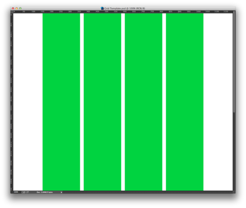
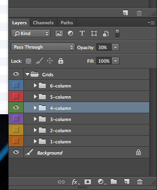
Next I stick them all into a layer group so we can turn the group on and off as we’re designing.
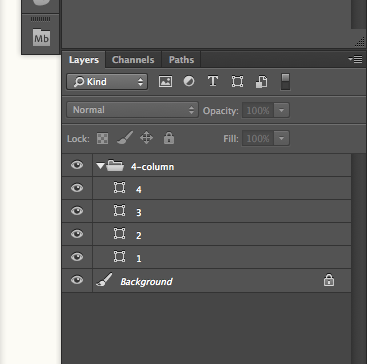
I just created the 4-column grid so next I would create any other grids I want to use, such as 1-column, 2-column, 3-column and so on until I have about 6 grids, each in it's own layer group. Some designers create layouts where they've broken their design down into like 16 or even 24 columns but practically speaking, I usually only need about 6 (very occasionally 8).
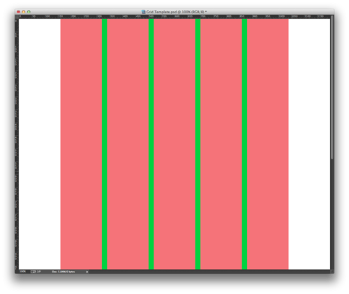
Next I crank down the opacity of each grid overlay group so we can see our design through them. Making the shapes in each grid a unique color helps you distinguish one grid overlay from another when you have multiple groups turned on. I usually assign a color to each group too and try to make the color of the shapes roughly the same as the color of the layer group as a handy mental reminder of which grid/group is which.
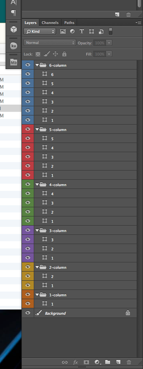
I also like to take all of my layer groups and put them in one big layer group - this lets you turn multiple grid overlays on and off at the same time and also cleans up your layers palette a bit. You can now leave your main layer group at the top of your layers stack and design your site beneath your semi-transparent grid overlays. Neat!
Nice grid. Now what?
So now you've got a template and you're ready to start designing your site and aligning the edges of your content to the edges of your grid columns. I don't have a lot of tips for this part since you kind of have to feel this one out for yourself but the more stuff you can align to your grid the more structured and organized your layout is going to feel. Sometimes you have no choice but to not align something to the grid and it's worth mentioning that sometimes that's okay! Some designers panic when they're starting out and think absolutely everything has to align to the grid but the grid is really more of a general guideline. It's best to stick to it but occasionally you just can't avoid it so just use your best judgement and remember that figuring out when to do this and when not to comes with experience.
That's all folks - hopefully this has been helpful. I know when I started working with grids it kind of seemed like this really important thing that pro designers do but I didn't really know how to start doing it myself. Good luck and happy gridding!